
Survival & Flourishing

Grantmaking tools for web, iPad and iPhone.

My role
Design lead, hands-on implementation
Web tools
Shipped
Native apps
TestFlight
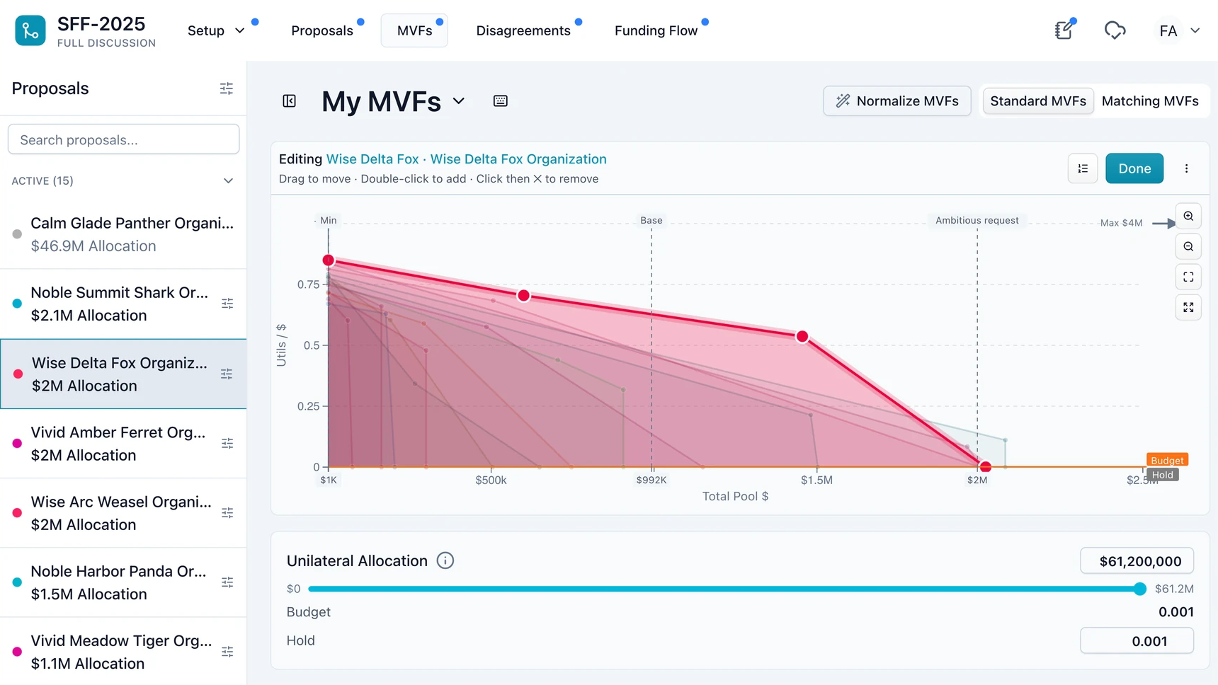
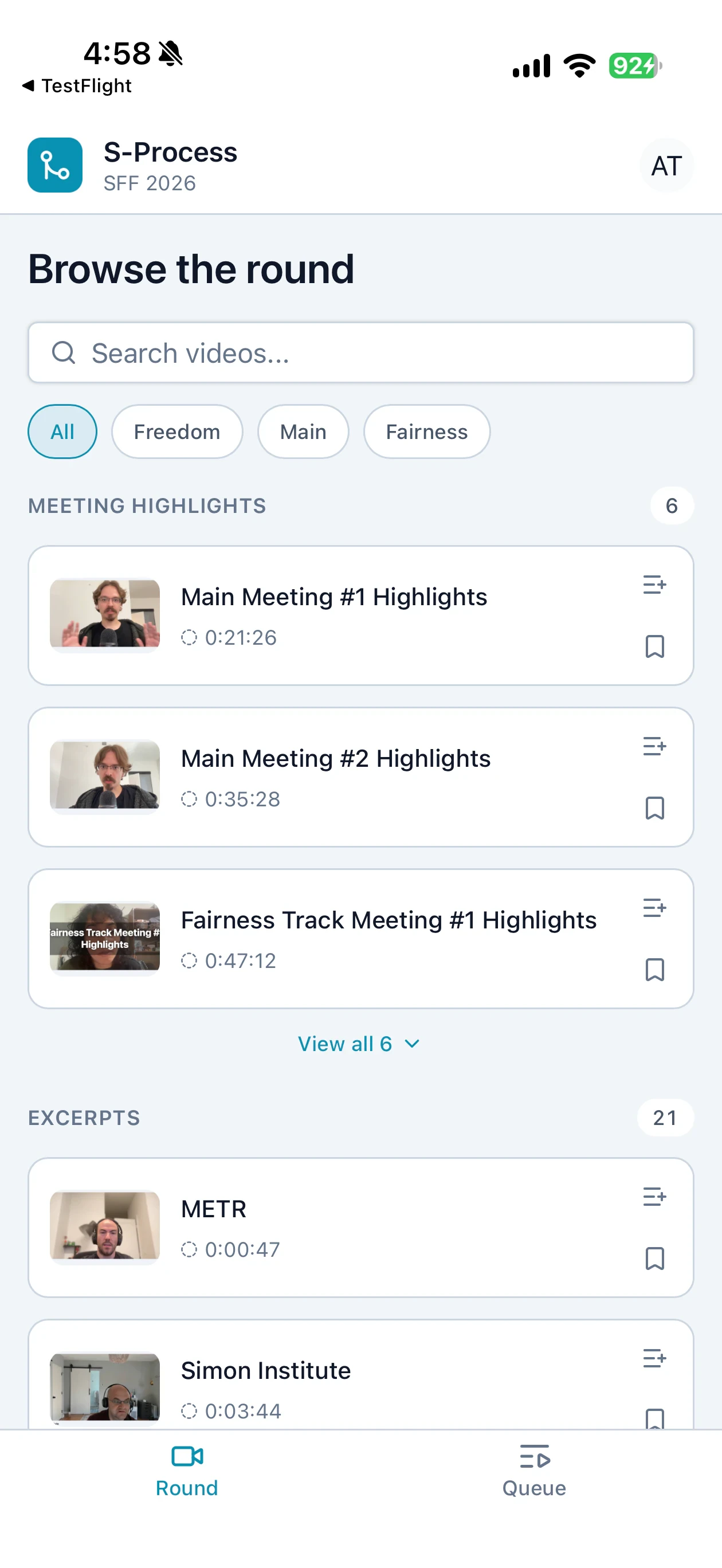
The SFF web app comparing marginal-value curves.The native iPhone app browsing meeting highlights and excerpts.
Recommender workspace and native round browserProduction web UI / TestFlight app

From review to allocation

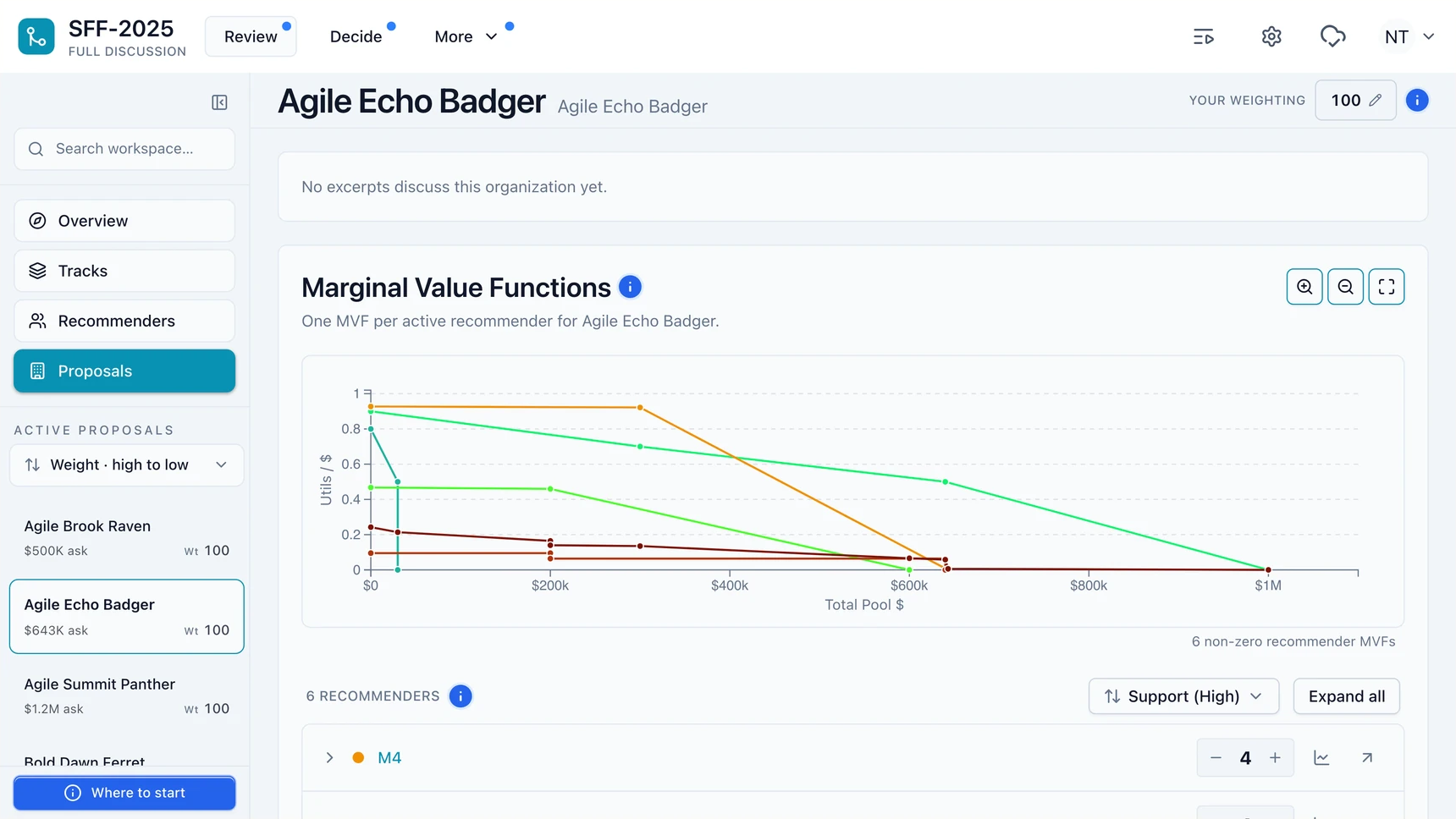
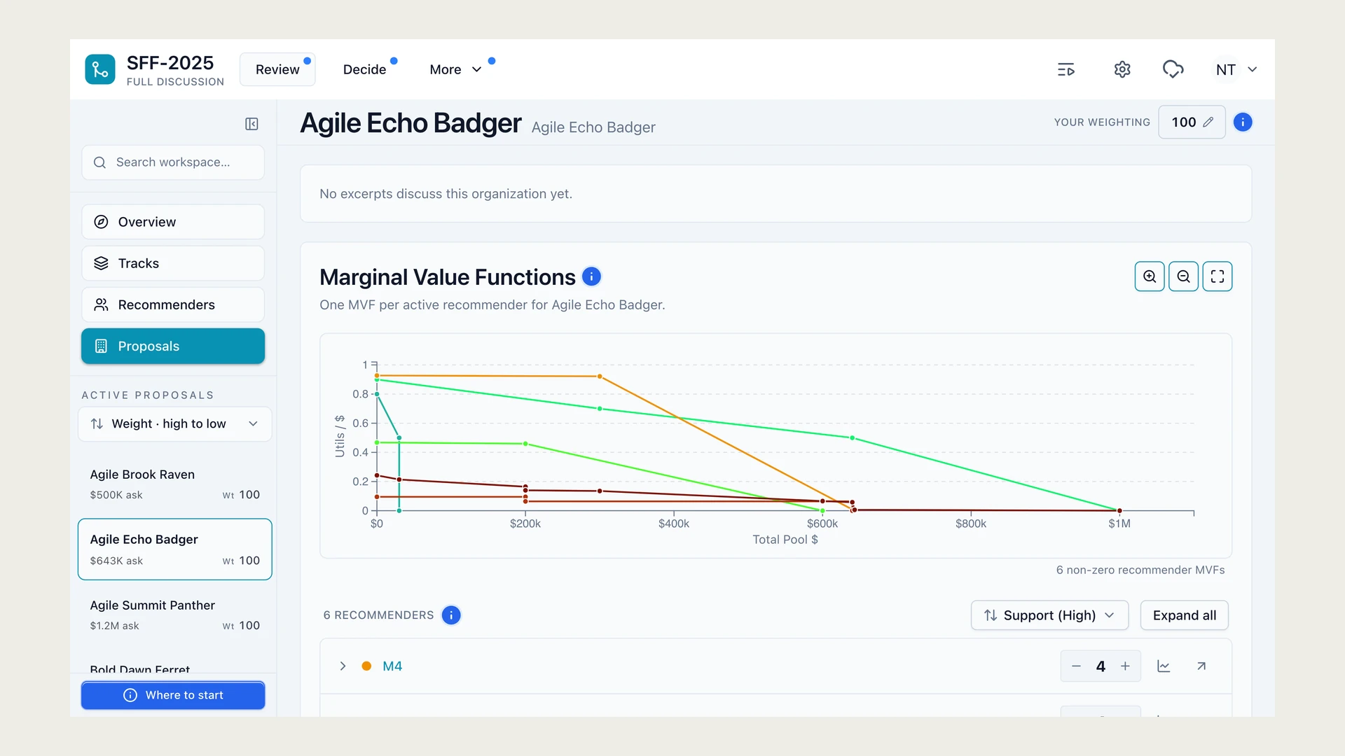
The funder review interface comparing six recommender curves.
Review proposals and recommender judgments
The funder allocation table showing proposal totals and individual inputs.
Compare allocations across the round

Keep the meeting in view

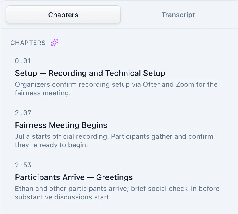
On iPad, I placed chapters beside the video so reviewers can navigate the meeting while keeping the video in view.

The iPad landscape layout with video and chapters side by side.
Landscape iPad layout. Native TestFlight capture.
An unaltered close-up of the chapter list with timestamps and summaries.
Chapter navigation.

SFF retained product ownership and final approval.

More product viewsReviewer detail, applicant prototype and native layouts

Supporting views

A dense system still needs a clear place to start.

An anonymized Funder Review workspace showing overlapping recommender MVF curves and the recommenders behind them.Loading product artifact.
Production surfaceFundersOpen full-size
  • Compare the judgments

    One proposal’s recommender curves share a funding axis, making agreement and disagreement visible across funding levels.

  • Keep people attached

    The recommender list sits directly below the curves, with individual weighting controls still available.

Funders needed to inspect one proposal’s recommender curves and the people behind them without losing the rest of the allocation context.

I led the interaction and visual design for the review workspace so a dense set of recommender judgments stays readable before anyone locks an allocation. The iPad meeting workspace lives in the device section below.

One product family, rebuilt around each device.

Exact TestFlight builds, shown inside dimensionally calibrated hardware. The phone changes the navigation and reading order; the iPad reorganizes the workspace around portrait and landscape.

S-Process builds in TestFlightiPhone + iPad
Open full-size capture

The round, rebuilt for one hand.

iPhone app / TestFlight. Shipped TestFlight app · engagement finished

Browse recordings, save evidence, build an Up Next queue, then move into chapters and transcripts without leaving the round.

I led the mobile interaction and visual design across the round browser and viewing flow, including its touch-first queue, chapters, and transcript structure.

The workspace responds to the way the iPad is held.

iPad app / TestFlight. Shipped / supported the 2026 grant round

Review a long meeting, move between chapters and transcript, and scan the rest of the round without giving up the primary workspace.

I led the iPad interaction and visual design and worked hands-on through implementation, including the portrait stack, landscape split view, and touch behavior.

The SFF team owned the product and shared final approval. Both captures are TestFlight evidence.

The system carried a full grant round.

The production recommender and funder surfaces supported the 2025 grant round, and the redesign continued through live use. The applicant portal remains a separately labeled design prototype.